Open Layout Tutorial
This page is an example of a simple Open Layout page to follow for this tutorial.
Open Layout pages are made of panels - even the most simple Open Layout pages will have at least 2 panels.
Each panel has the following parts with adjustable settings:
Panel -> Container -> Row -> Column -> Block
Let's dive into setting up your own open layout page by taking a look at the 2 standard panels you'll start with - the Header Image Panel and the Main Panel.
Creating the Header image panel
Panel 1 (Header Image)
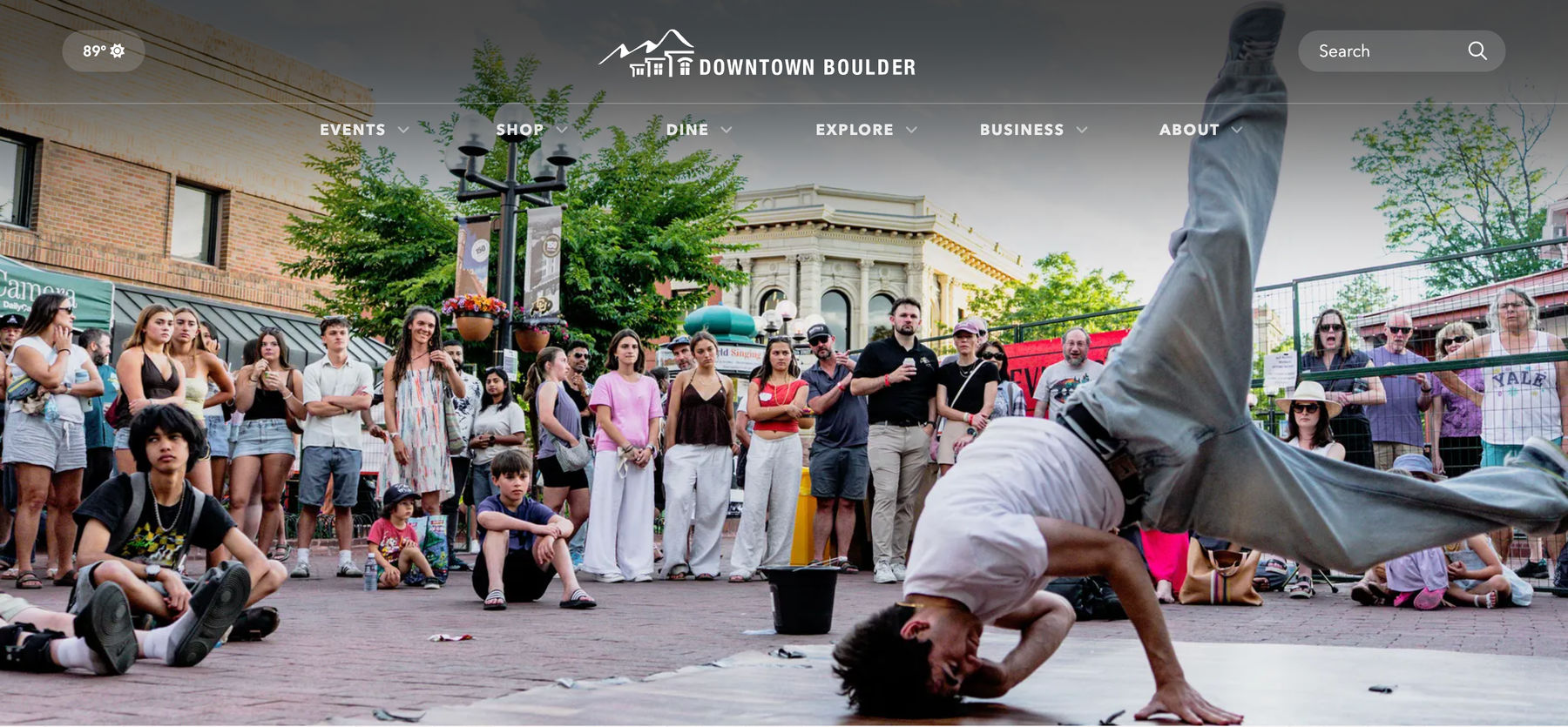
This panel adds an image or video to the top of the page, which can be seen underneath the transparent global header and continues down the page. This panel is required due to the style of the global header.
Panel 1 Summary
- Panel - internal label set to "Header Image"
- Container - container class set to "container-none"
- Row - row class set to "row g-0"
- Column - column class set to "col-12"
- Block - add block "Hero Image"
Step by Step Guide
Panel Settings for Panel 1
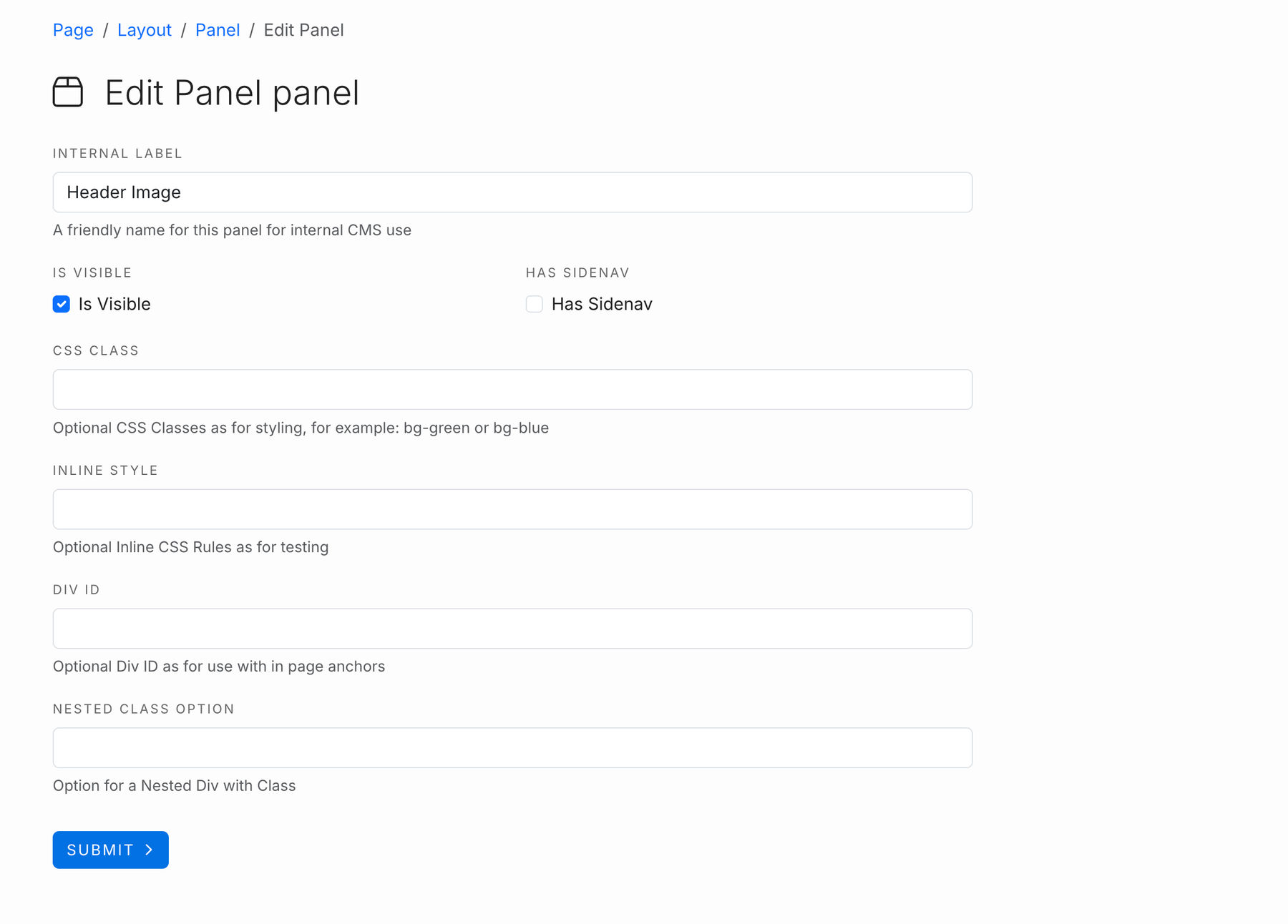
Set your internal label to "Header Image" - this is an internal use field only but keeps our layout parts easy to follow.
Is Visible should automatically be checked and appear in the blue box, but if its not, check the box & select submit.
No other fields need to be filled out for Panel 1's settings. Let's go to the container for Panel 1 next.
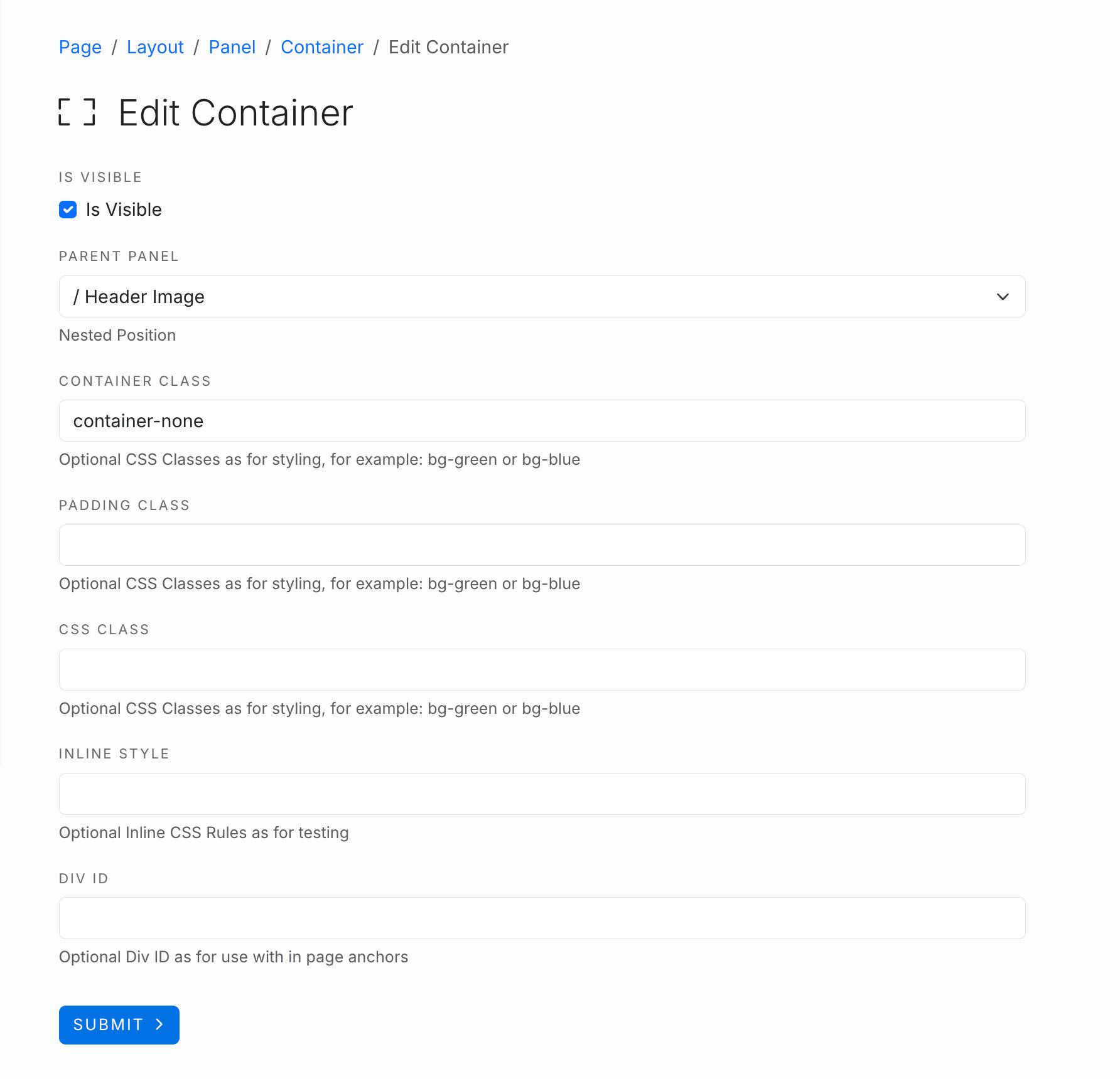
Container settings for Panel 1
Is Visible should automatically be checked and appear in the blue box, but if its not, check the box & select submit.
Set the container class field to
container-none
This makes the image expand the full width of the panel/page with no left or right side padding.
Leave the rest of the fields here blank.
Row Settings for Panel 1
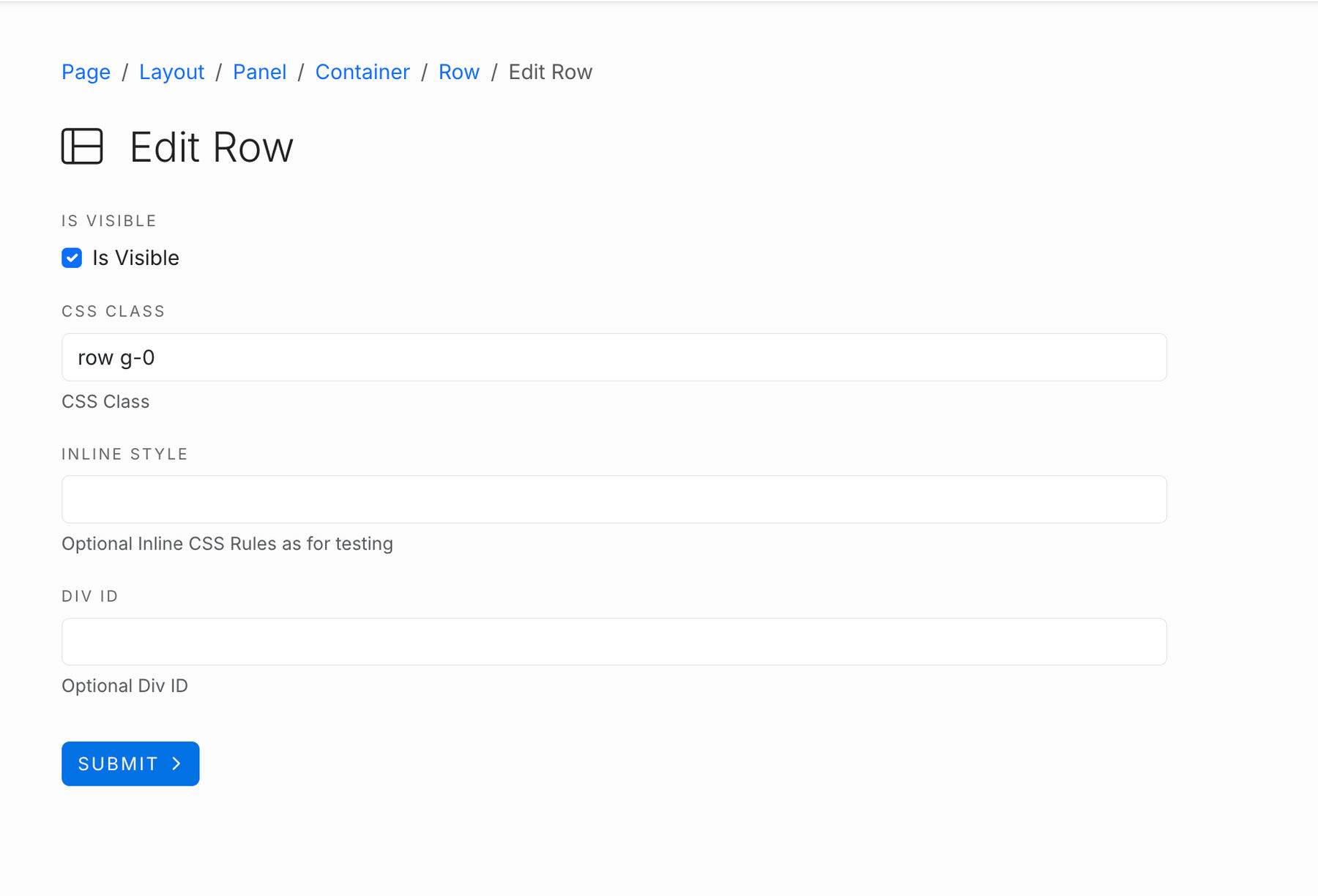
Set the first CSS Class Field to
row g-0
Leave inline style & DIV ID fields blank.
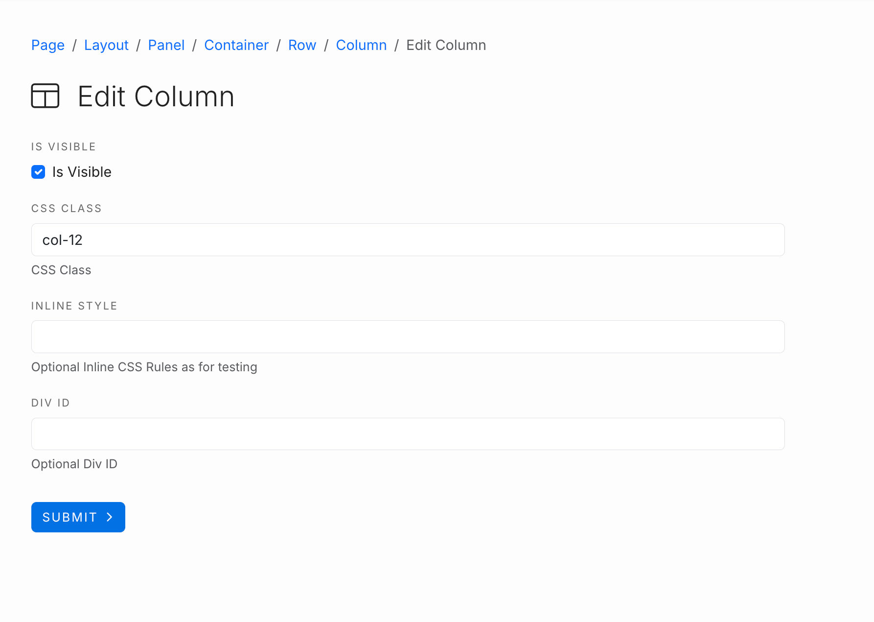
Panel 1 Column Settings
Set the first CSS Class field to
col-12
Leave the other two fields blank.
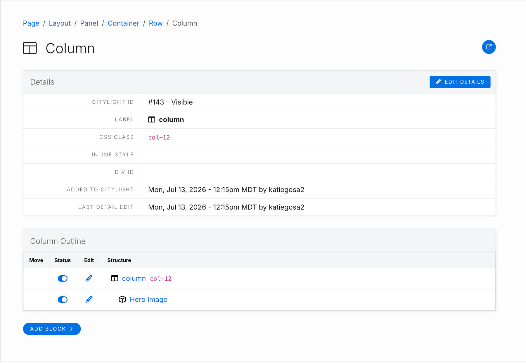
Block Settings for Panel 1
Select the blue pill button "Add Block" at the bottom of the column overview page.
Choose "Hero Image" from the drop down menu of choices.
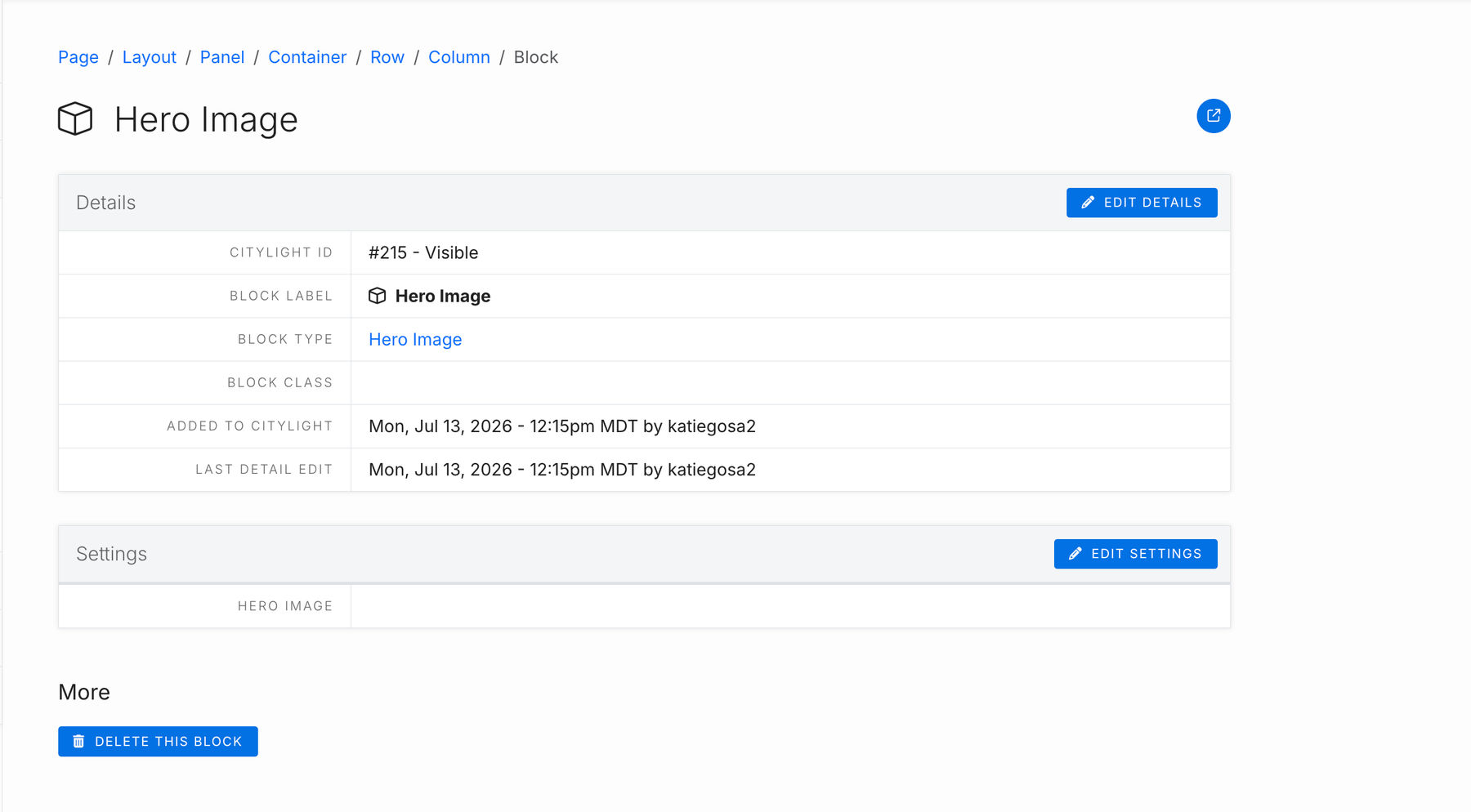
Hero Image Block
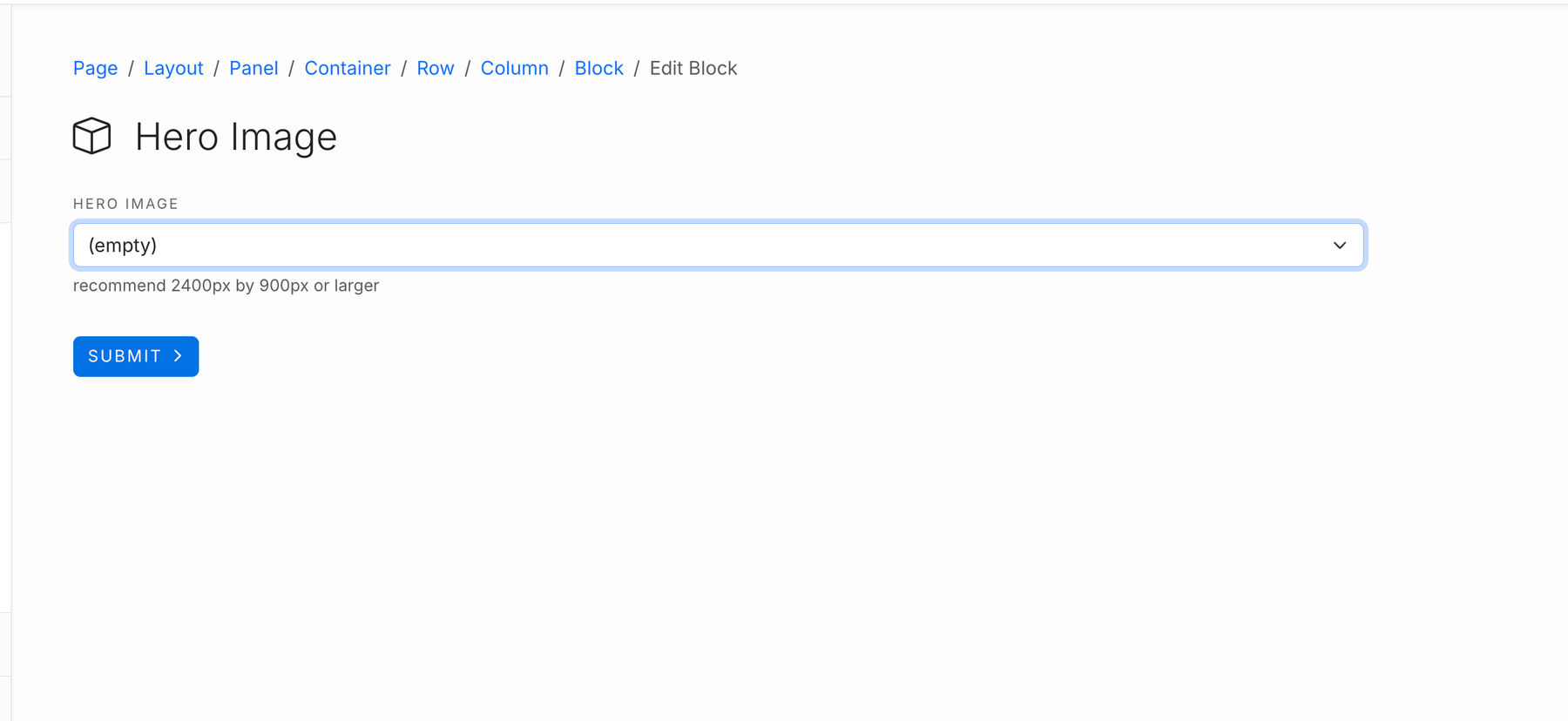
In the second box - "Settings" - select the blue button "Edit Settings" to select which image to appear as the header image.
A dropdown menu will appear with all the images uploaded in your Citylight Image library. Most recently uploaded images appear at the top of the list.
We recommend using images with 2400px by 900px or larger for best resolution and screen responsiveness.
Once you've chosen your image from the drop down menu, hit the blue "Submit" button and you are complete with the first panel set up!
Now let's talk about how to set up Panel 2!
Panel 2 (Main Body Content)
This panel is where the page's body content lives.
If you decide your page needs a sidenav, this is the panel whose settings you would enable the panel setting sidenav.
This panel typically contains a container-fluid container, with a row (row class g-3), a column (class col-12), and the HTML block type.
You can build on the page content from there by adding additional blocks such as a basic card grid, a domino card, or a sponsor logo block.
Preview These Block Types in Use
Panel 2 Summary
- Panel - internal label set to "Main"
- Container - container class set to "container-fluid" and padding class "padding-top" and "padding-bottom"
- Row - row class set to "row g-3"
- Column - column class set to "col-12"
- Block - add block "Simple HTML" and other blocks as desired.
Step by Step Guide
Panel Settings for Panel 2
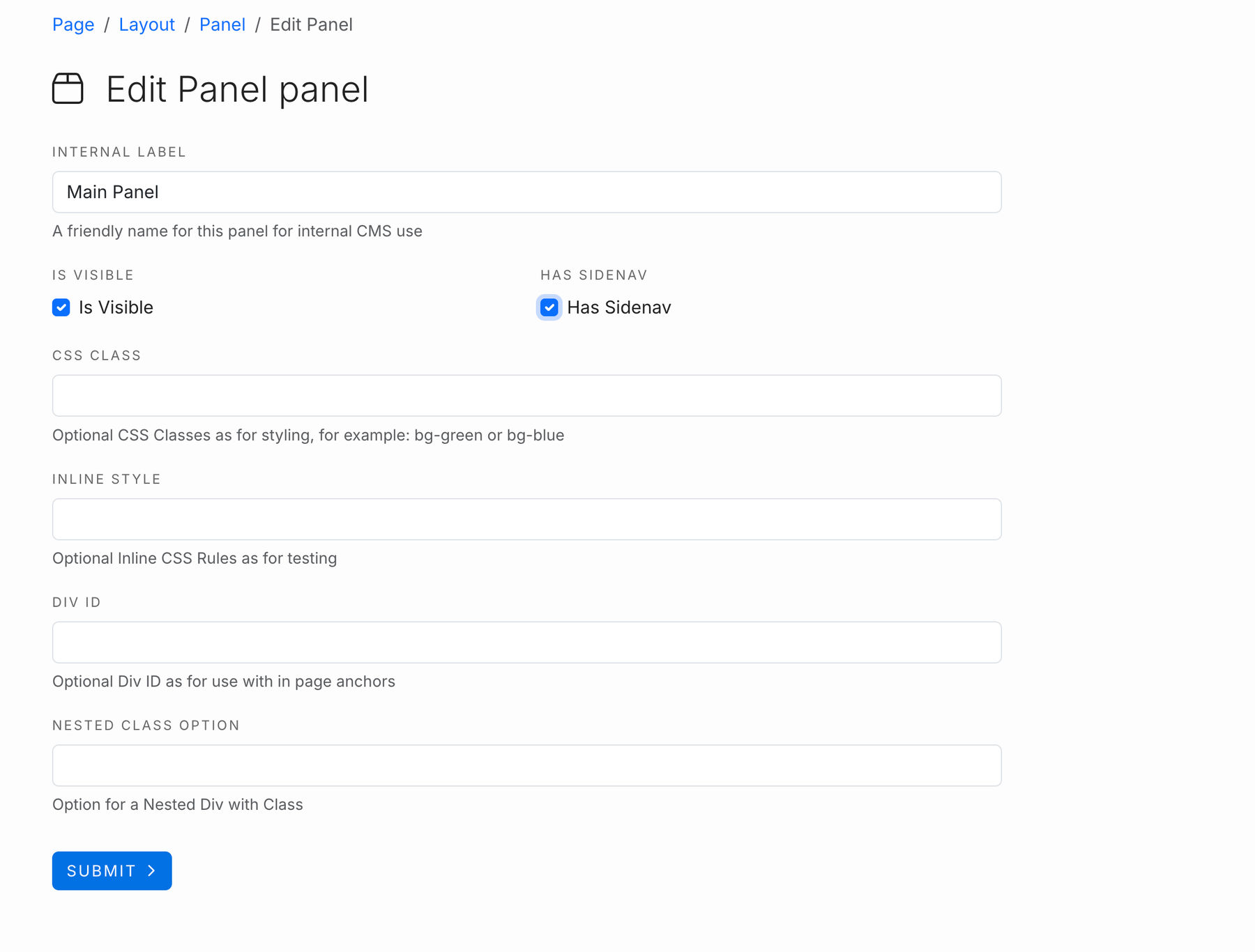
Set your internal label to "Main" - this is an internal use field only but keeps our layout parts easy to follow.
Is Visible should automatically be checked and appear in the blue box, but if its not, check the box & select submit.
Enable a sidenav on the page by checking the box under Has Sidenav
Hit submit!
Container settings for Panel 1
At the bottom of the panel page, use the button to add a container. If given an option, select the container-fluid label.
Is Visible should automatically be checked and appear in the blue box, but if its not, check the box & select submit.
Set the container class field to
container-fluid
This makes the container's content expand across the page while keeping some padding on both left & right sides.
Set the Padding Class to
padding-top
padding-bottom
This will add padding between the top image panel and this panel, as well as add padding between this container and the page footer. It is ideal to use on Main panels so your page has proper spacing and flows well.
Row Settings for Panel 2
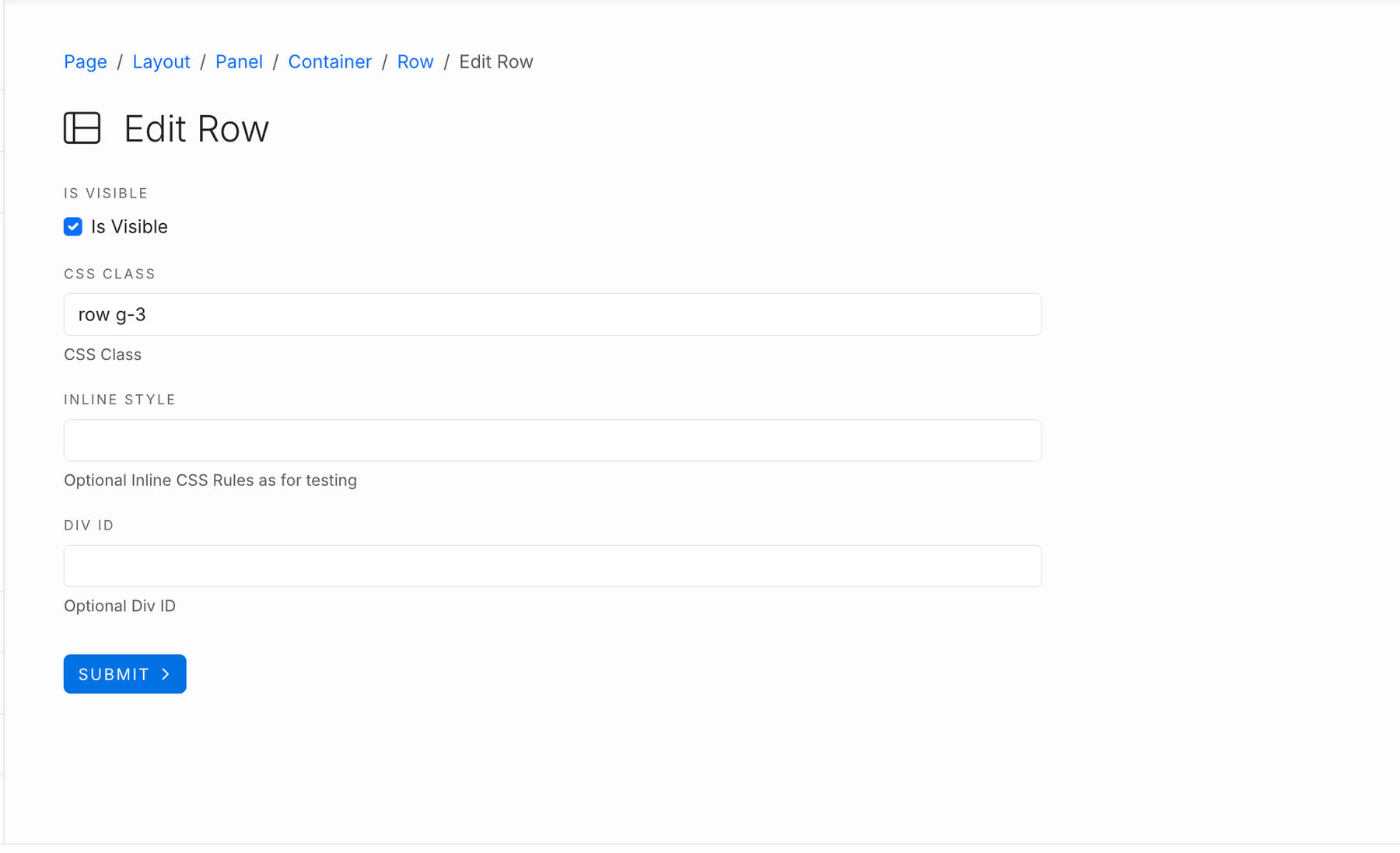
Set the first CSS Class Field to
row g-3
Leave inline style & DIV ID fields blank.
Panel 2 Column Settings
Set the first CSS Class field to
col-12
Leave the other two fields blank.
Block Settings for Panel 2
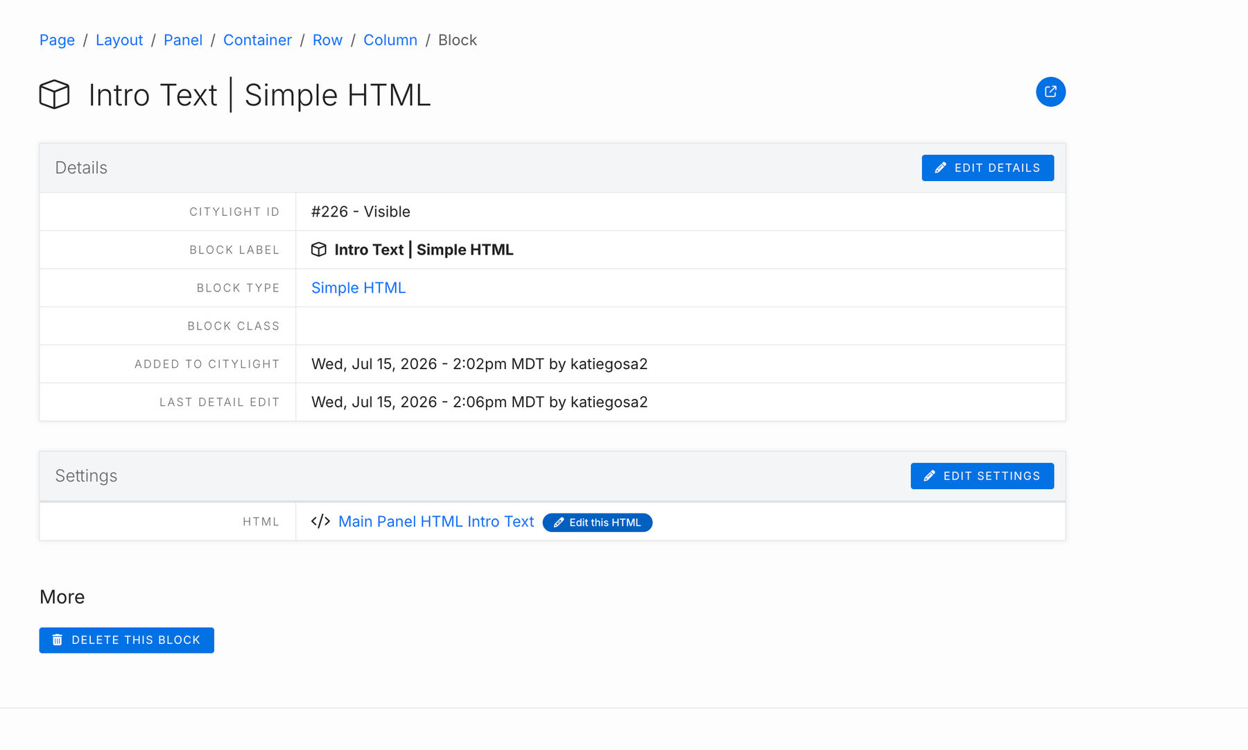
Select the blue pill button "Add Block" at the bottom of the column overview page.
Choose "Simple HTML" from the drop down menu of choices.
Common Block Options to add to column
- Basic Card Grid
- Domino Cards
- Sponsor Logos
Basic Card Grid
Create Card Set with the template "Open Layout Card" to populate the card grid content.
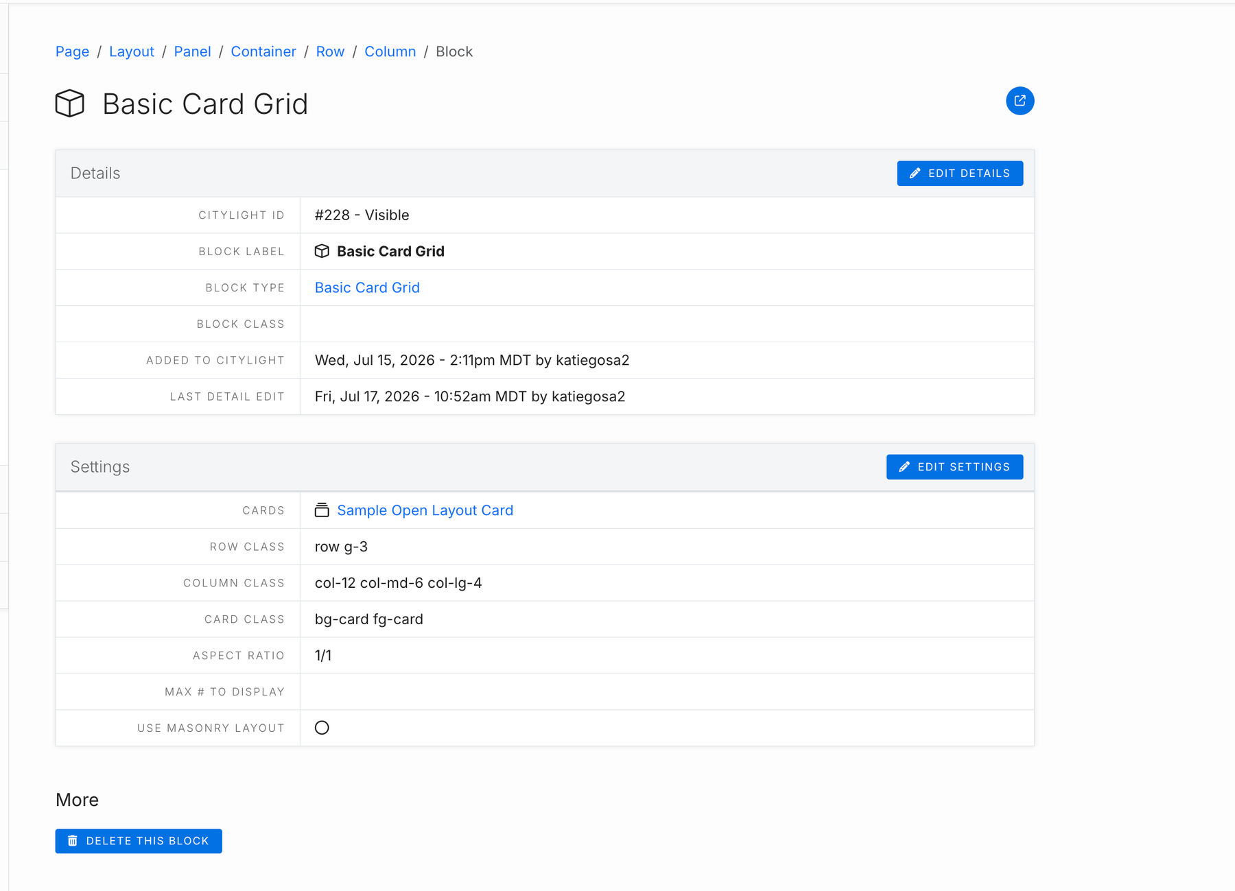
Basic Card Grid Setting Fields
Cards: Select the card set from the drop down menu of the Open Layout Card Set you'd like to appear.
Row Class: Controls spacing between the cards and margins. You can set the g-# number to any nuumber between 0-5.
Row g-0 will leave no space between each card
Row g-1 or g-2 will leave a small amount of space between each card
Row g-3 will leave an average amount of space between each card. Typically we use this one.
Row g-5 leaves the most amount of space between cards.
Column Class: This is based on 12 equal divisions of the row the column lives in. You can use col-md-# and col-lg-# to set different behavior for different screen sizes. col-12 is mobile size (and all other screen sizes if no col-md or col-lg is set). col-md-# is the tablet size screen behavior, and col-lg-# is the desktop size screen behavior.
- A one column layout uses 100% of the available space, all 12 possible divisions of the row. The code for this is col-12 which we apply automatically when the field is blank.
- For an even two column layout, make two columns, and set each to col-6 so that each uses 6/12 (50%) of the space.
- For an even three column layout, make three columns, and set each to col-4.
- For an even four column layout, make four columns, and set each to col-3.
- You cannot make five equal columns, because 12 is not evenly divisible by 5.
Common Codes:
- Use col-6 for a consistent 50/50 split.
- Use col-12 col-lg-6 for 100% on mobile and 50% on desktop. Very common!
- Use col-12 col-lg-4 for 100% on mobile and 33% on desktop. Very common!
- Use col-12 col-lg-3 for 100% on mobile and 25% on desktop.
- Use col-6 col-lg-3 for 50% on mobile and 25% on desktop.
Leave Layout Grid blank when you always want to use all the available width, all the time.
Aspect Ratio: Set this to the average dimension ratio of the images assigned to cards. 1/1 means the image is a square. Other common aspect ratios are 1/2, 3/2, 2/1, or 4/3.
Max # to Display: Will only display the first # you set here of the cards in a card set. If you have a card set assigned with 20 cards, but set max # to display to 5, it will only show the first 5 cards of that set. Otherwise, if you leave it empty, all cards in the selected card set will display.
Use Masonry Layout: Check this box to flow the cards vertically based off card content height, instead of forcing all cards to be the same height.
Domino Cards
Domino Cards show an image to the right of text content set for a card in desktop view, but rotate to have the image display on top of the card text content in mobile view.
You'll use the card set template type "Open Layout" for cards used in this block type.
In the domino block, you'll see two sections - the first called "Details" and the second called "Settings".
Domino Block Details
You can use the details block class field to add the following block classes to the domino block. They create different visual effects on the domino cards by adding spacing and shadowing.
domino-boulder-split
domino-boulder-shadow
my-4
You can add these to the domino block by choosing edit details, then copying and pasting the above classes into the CSS field. Try adding one or more of the above classes and then refreshing your page preview to see what happens!
Domino Settings

In the Domino Settings section, this is where you'll choose which card set to display as a domino card set with the cards field.
Max # to Display: Will only display the first # you set here of the cards in a card set. If you have a card set assigned with 20 cards, but set max # to display to 5, it will only show the first 5 cards of that set. Otherwise, if you leave it empty, all cards in the selected card set will display.
Row Reverse: Have the domino card image display on the right of the card text content instead of the left for tablet/desktop screen sizes.
Alternate Rows: Have the image alternate which side of the card text content it displays on.
Sponsor Logos
To display sponsor logos, you have two block options:
- Sponsor Logos
- Sponsor Logos (Rotating Marquee)
See examples of both at the bottom of the page.
For either block type, you'll need to make an image gallery (Library->Galleries) that contains each logo you want displayed in that block. If you are displaying multiple tiers of sponsors, make an image gallery for each tier.

The Sponsor Logos block option comes with an intro html that you can use to add the title of the sponsorship tier or any other message that you'd like to appear above the logos.
If you set the block class (Edit Details button -> CSS Class Field) to
text-center
then both the text in the intro html and the logos displayed will align in the center of the page.
Sponsor Logos Rotating Marquee
Note that the larger number of logos in the image gallery, the faster the images will rotate.
While the regular Sponsor Logos block comes with an intro html to set for text above the logo grid, rotating marquees do not. If you'd like text to appear above your rotating marquee block, add a simple html block to the column first, then add the rotating marquee block.
Additional Tips
If you want more padding between the sponsor logo sections, you can add any of the following to the block class:
padding-top
padding-top-half
padding-bottom
padding-bottom-half